Packaging & Print — PERSONAL PROJECT
In the 1970s, videotape entered home use, creating the home video industry and changing the economics of the motion picture and television businesses. In the later 1970s and early 1980s, there was a format war in the home video industry. Two of the standards, VHS and Betamax, received the most media exposure. VHS eventually won and emerged as the dominant home video format throughout the tape media period. Throughout the 1980s and into the ‘90s VHS was a huge part of culture and technology.
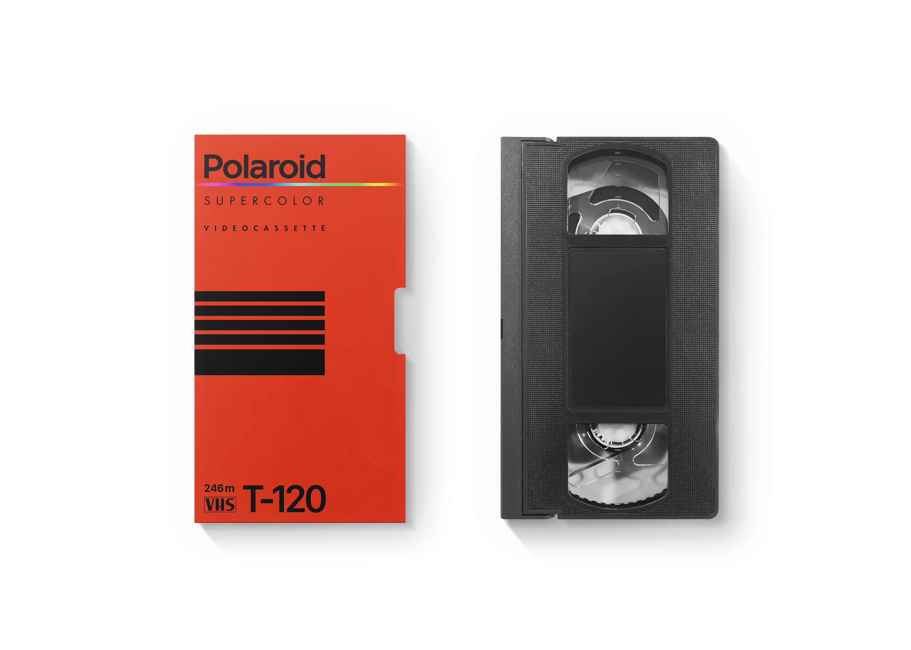
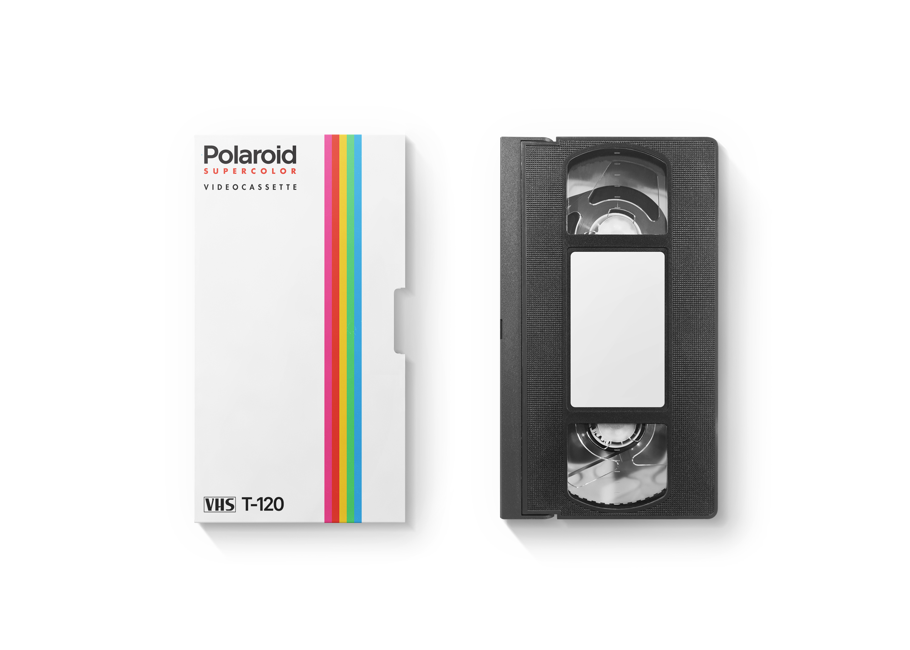
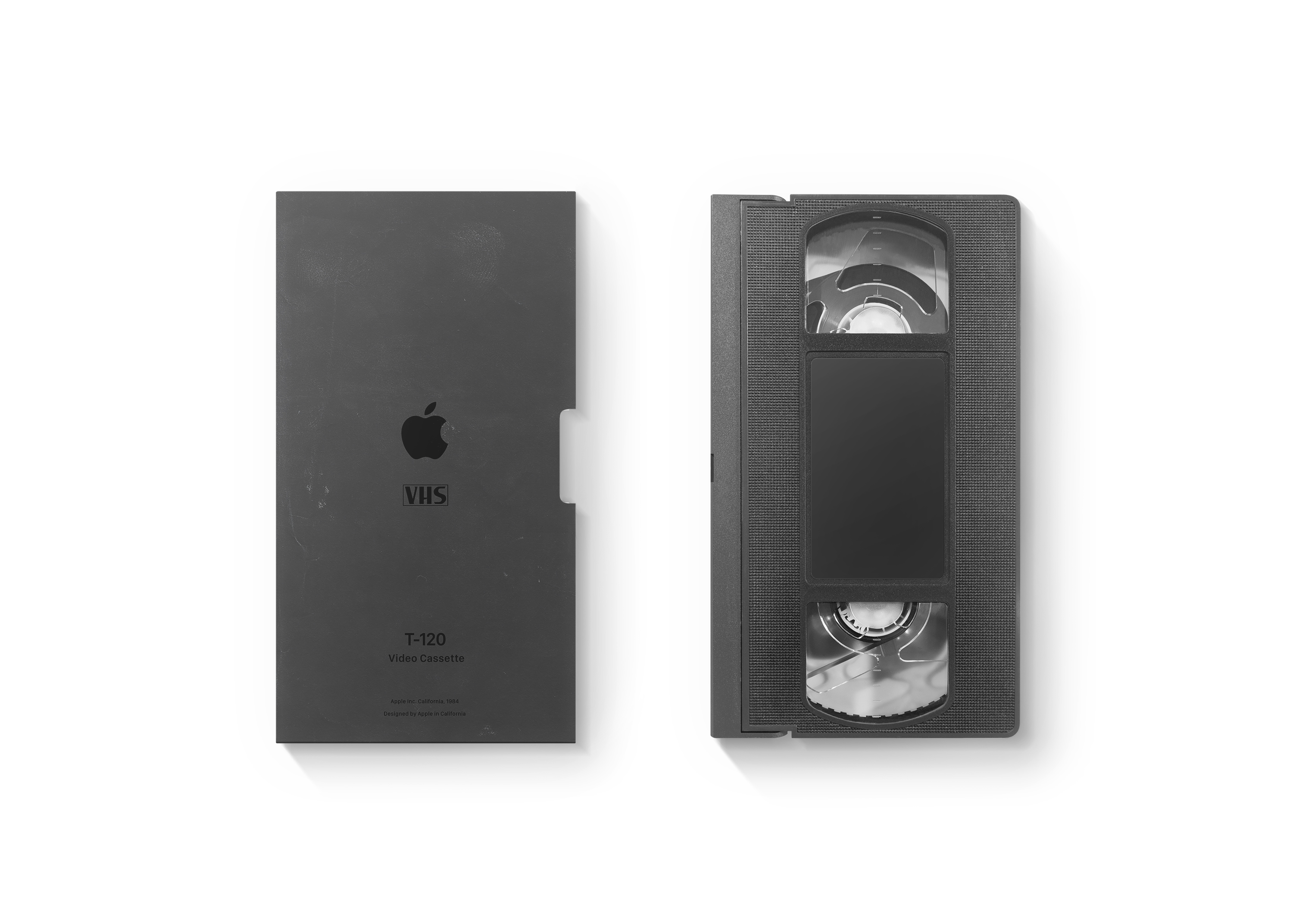
One of the things I find extraordinarily interesting is blank VHS cassette packaging design. VHS cover art and design showcase a wide range of [graphic] design trends of that time.
I designed these as new interpretations of some designs from the ‘80s.


Design Story:
Style Choices:
The project is meant to evoke ‘80s and early ‘90s visual language. Bold colours and gradients, geometric shapes, dusty and gritty pixel-like textures, and visually strong typography. Elements that were very much part of VHS packaging and media from that era. The choice of colour palettes is based on the tech and pop culture of those times. The design style is given a modern twist and opted for an overall cleaner, more balanced and simple feel, but keeping it a bit gritty, matching the imperfect, analog feel of VHS tapes.
Concept:
The concept is a nostalgic reimagination of a physical media format that’s mostly obsolete today. VHS tapes are iconic not just for the tech but for the experience and culture surrounding them—like the excitement of renting VHS movies. By redesigning these covers, I hope to evoke nostalgic memories, and to remember and appreciate the tactile, imperfect charm of that era, contrasting with today’s mostly digital interfaces.
Design Execution:
The design choices are very intentional and crafted in detail. The layouts balance ‘80s aesthetics with somewhat more modern layout and approach. Reducing the sometimes visually loud style of VHS design of those times. Typography is chosen carefully to feel authentic and match popular type design of the ‘80s and ‘90s. The graphics combine clean vector shapes with analog textures.